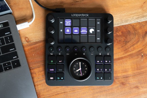
For photographers and videographers spending a lot less time on location and a lot more time at the desk right now, one great use of time is going back through archives and backlogs to find hidden gems, and hone those edit skills. One recently-released device called the Loupedeck CT can make that an even more enjoyable experience, with customizable controls and profiles that work with just about all your favorite editing apps – and that can even make just using your computer generally easier and more convenient.
The basics
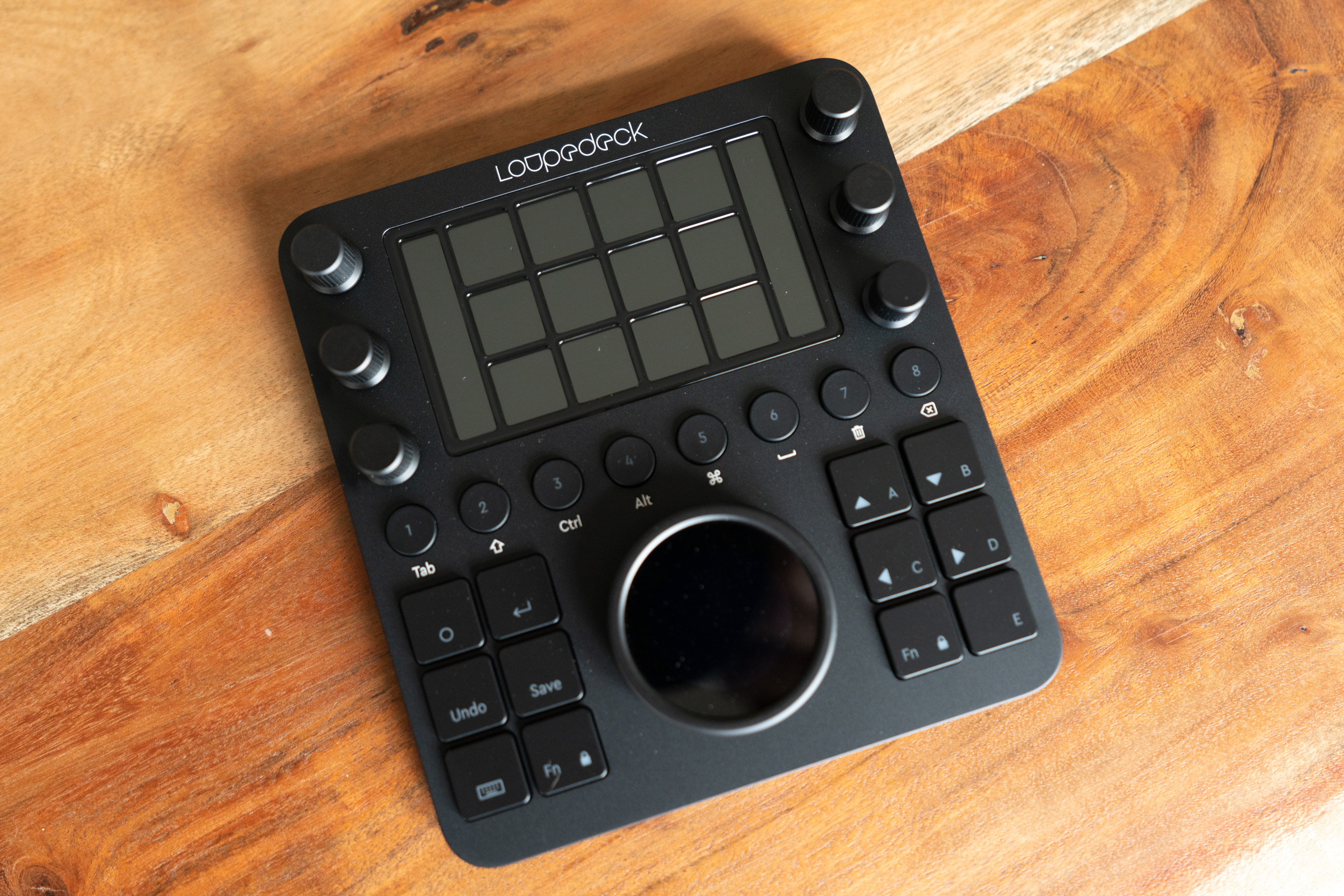
Loupedeck’s entire focus is on creating dedicated hardware control surfaces for creatives, and the Loupedeck CT is its latest, top-of-the-line editing panel. It’s essentially a square block, which is surprisingly thin and light given how many hardware control options it provides. On the surface itself, you’ll find six knobs with tactile, clicky turning action, as well as 12 square buttons and eight round buttons, each of which features color-coded backlighting. There’s also a large central control dial, with a touch-sensitive display in-set, and a 4×3 grid of touch-sensitive display buttons up top – each of which also includes optional vibration feedback when pressed.
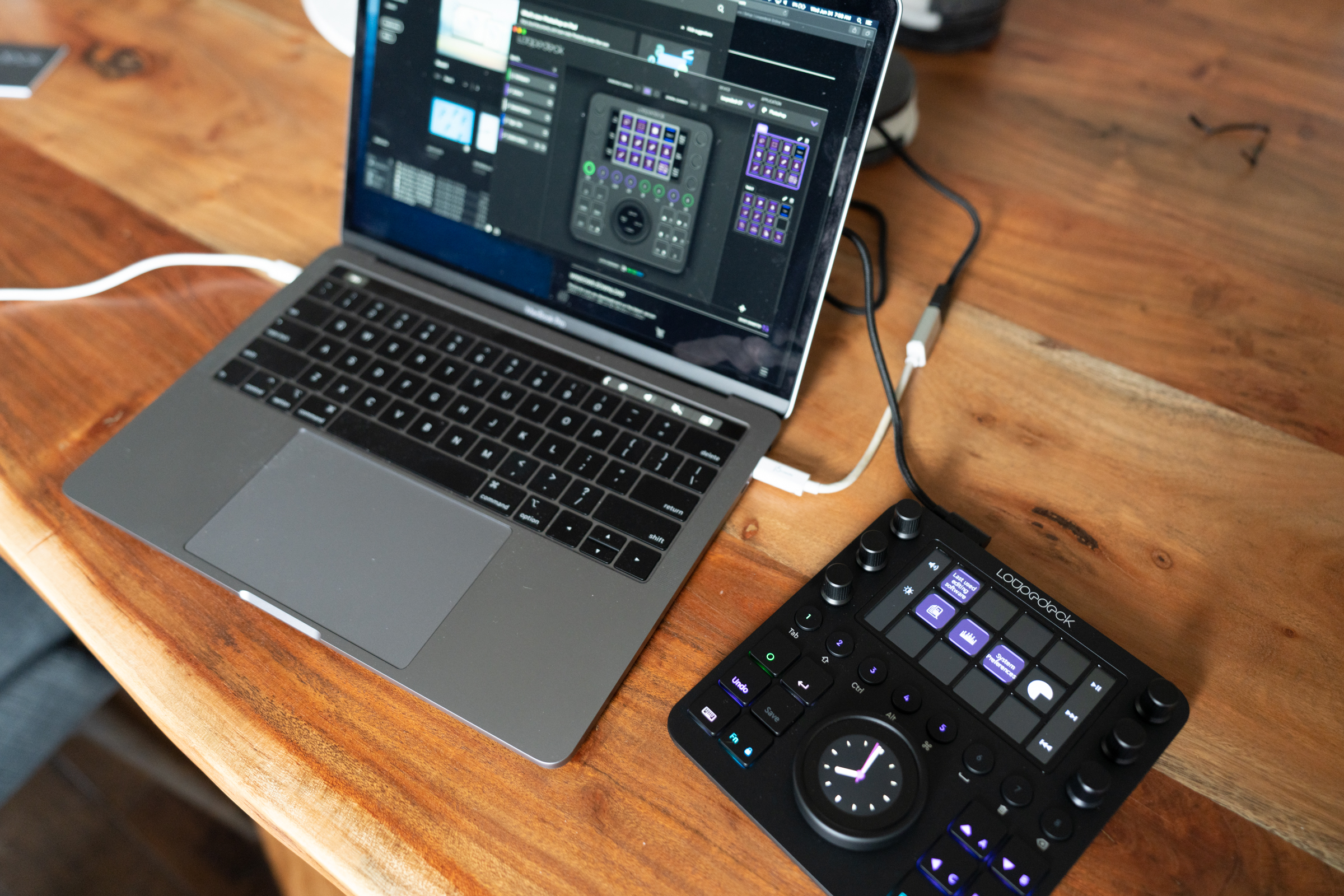
Loupedeck CT connects via an included USB-C cable (though you’ll need an adapter or your own USB-C to USB-C cable if you’re using a modern MacBook) and it draws all the power it needs to operate from that connection. Small, rubberized pads on the back ensure that it won’t slip around on your desktop or table surface.
 When you first set up the Loupedeck, you’ll need to download software from the company’s website. Once that’s installed, the setup wizard should see your Loupedeck CT hardware when it’s connected, and present you with configuration options that mirror what will show up on your device. By default, Loupedeck has a number of profiles for popular editing software pre-installed and ready to use, and it’ll switch to use that profile automatically upon opening those applications.
The list is fantastic, with one notable (and somewhat painful) exception – Lightroom CC. This isn’t Loupdeck’s fault: Adobe has changed the way that Lighroom is architected with the CC version such that it no longer offers as much interoperability with plugins like the ones that make Loupedeck work with such high integration. Loupedeck offers a Lightroom Classic profile, and one of the reasons Classic is still available is its rich support for these plugins, so you can still access and edit your library with Loupedeck CT. Plus, you can still use it to control Lightroom CC – but you’ll have to download a profile that essentially replicates keystrokes and keyboard shortcuts, or create your own, and it won’t be nearly as flexible as the profiles that exist for Photoshop, Photoshop Camera Raw, and Lightroom Classic.
That one exception aside, there are profiles for just about any creative software a creative pro would want to use. And the default system software settings are also very handy for when you’re not using your computer for doing anything with image, video or audio editing. For instance, I set up basic workflows for capturing screenshots, which I do often for work, and one for managing audio playback during transcription.
Design
 I mentioned it briefly above, but the Loupedeck CT’s design is at first glance very interesting because it’s actually far smaller than I was expecting based on the company’s own marketing and imagery. It’s just a little taller than your average keyboard, and about the same width across, and it takes up not much more space on your desk than a small mousepad, or a large piece of toast. Despite its small footprint, it has a lot of physical controls, each of which is actually potentially many more controls though software.
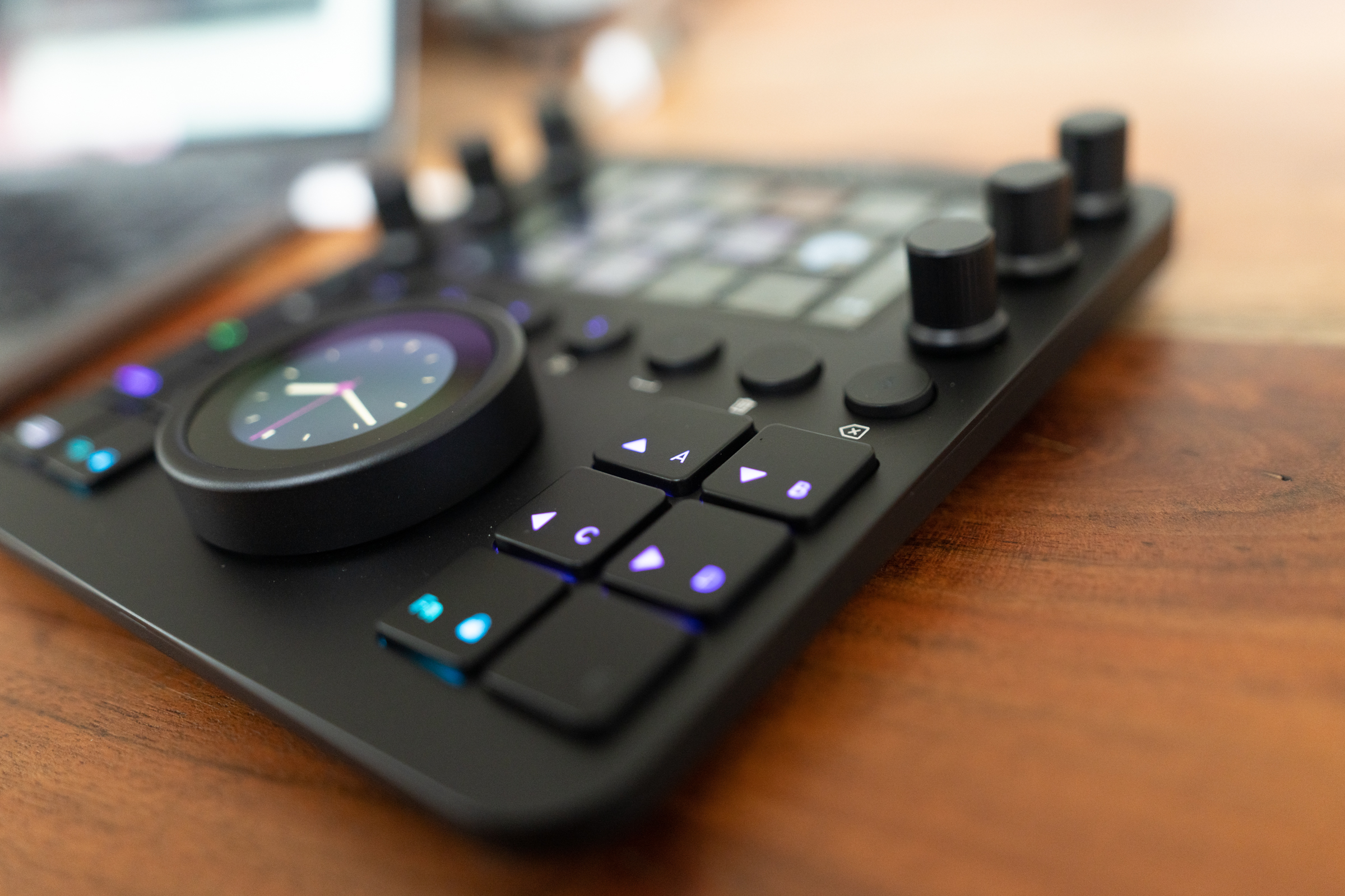
The matte black, slightly rubberized finish is pleasing both to look at and to the touch, and the controls all feel like there was a lot of care put into the tactile experience of using them. The graduated clicks on the knobs let you know when you’ve increased something by a single increment, and the smooth action on the big dial feels delightfully analog. The buttons all have a satisfying, fairly deep click, and the slight buzz you get from the vibration feedback on the touchscreen buttons are a perfect bit of haptic response, which, combined with the raised rows that separate them, mean you can use the Loupedeck CT eyes-free once you get used to it. Each knob is also a clickable button, and the touchscreen circular display on the large central dial can be custom configured with a number of different software buttons or a scroll list.
Despite its small size, the Loupedeck CT doesn’t feel fragile, and it has a nice weight to it that feels reassuring of its manufacturing quality. It does feel like a bit of a compromise when it comes to layout to accommodate the square design vs. the longer rectangle of the Loupedeck+, which more closely resembles a keyboard – but that has positives and negatives, since the CT is easier to use alongside a keyboard.
 Ultimately, the design feels thoughtful and well-considered, giving you a very powerful set of physical controls for creative software that takes up much less space on the desk than even something like an equivalent modular system from Palette would require.
Features
The Loupedeck CT’s primary benefits are found in its profiles, which set you up out of the box to get editing quickly and effectively across your favorite software. Each feels like a sensible set of defaults for the software they’re designed to work with, and you can always customize and tweak to your heart’s content if you’ve already got a set of standard processes that doesn’t quite match up.
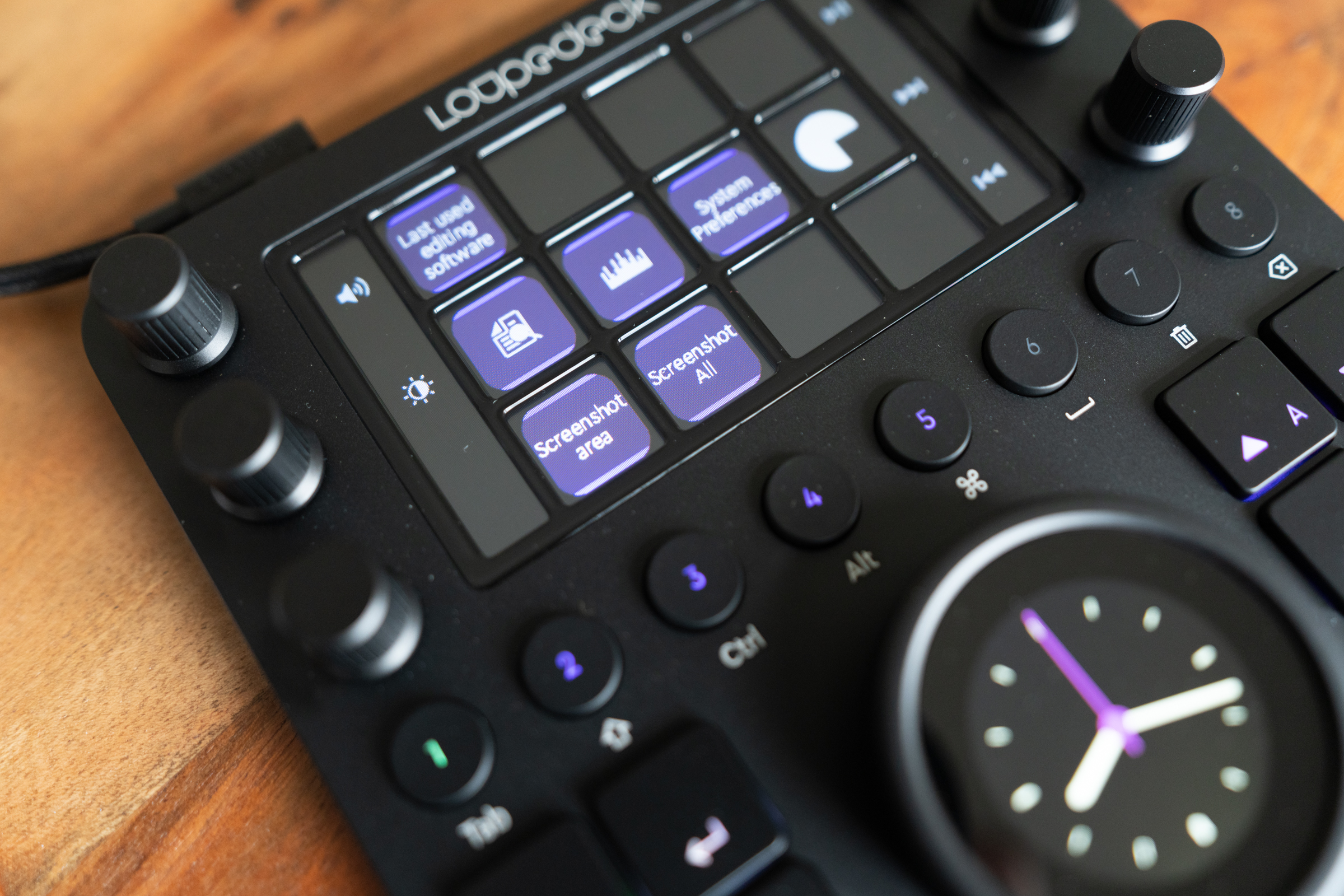 Loupedeck’s software makes customization and addition of your own sets of tools a drag-and-drop process, which helps a lot with the learning curve. It still took me a little while to figure out the logic of where to find things, and how they’re nested, but it does make sense once you experiment and pay around a bit.
Similarly, Loupedeck uses a color-coding hierarchy system in its interface that takes some getting used, but that eventually provides a handy visual shortcut for working with the Loupedeck CT. There are green buttons and lights that control overall workspaces, as well as purple actions that exist within those workspaces. You can set up multiple workspaces for each app, letting you store entire virtual toolboxes for carrying out specific tasks.
This allows the CT to be at once simple enough to not overwhelm, and also rich and complex enough to offer a satisfying range of control options for advanced pros. As mentioned, everything is customizable (minus a few buttons like the o-button that you can’t remap, for navigation reasons) and you can also export profiles for sharing or for use across machines, and import profiles, including those created by others, for quickly getting set up with a new workflow or pice of software.
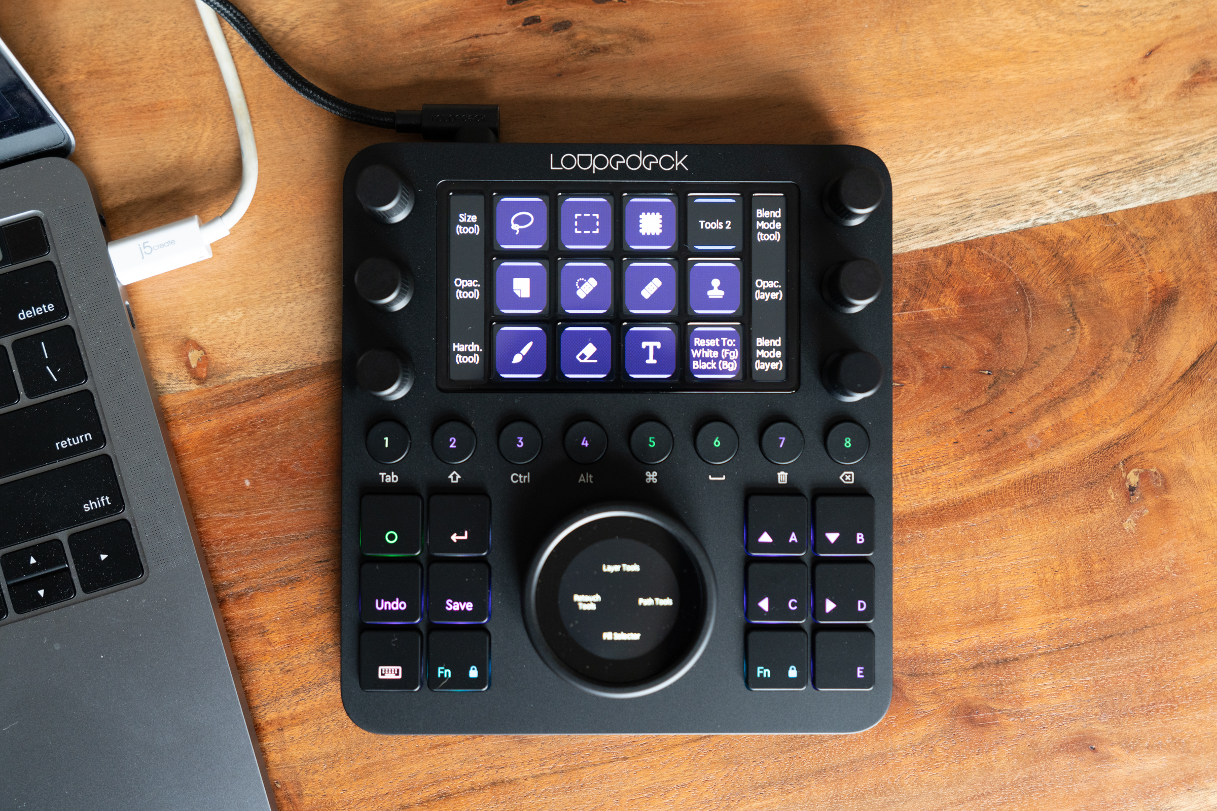 The Loupedeck CT even has 8GB of built-in storage on board, and shows up as a removable disk on your computer, allowing you to easily take your profiles with you – as well a tidy little collection of working files.
Bottom Line
At $549, the Loupedeck CT isn’t for everyone – even though the features it offers provide efficiency benefits for many more than just creatives. It’s like having an editing console that you can fit in the tablet pocket of most backpacks or briefcases – and it’s actually like having a whole bunch of those at once because of the flexibility and configurability of its software. Also, comparable tools like the Blackmagic Design DaVinci Resolve Editor keyboard can cost over twice as much.
If your job or your passion involves spending considerable time adjusting gradients, curves, degrees and sliders, than the Loupedeck CT is for you. Likewise, if you spend a lot of time transcribing or cleaning up audio, or you’re a keyboard warrior who regularly employs a whole host of keystroke combos even for working in something like a spreadsheet app, it could be great for you too.
I’ve tested out a lot of hardware aimed at improving the workflow of photographers and video editors, but none has proven sticky, especially across both home and travel use. The Loupedeck CT seems like the one that will stick, based on my experience with it so far.
