At Spotify’s Stream On event this month, the company introduced a redesigned app with TikTok-like discovery feeds, an AI DJ and other tools for artists and podcasters. But the app’s changes may not be stopping there. The company confirmed it’s now testing a revamp of its user profiles, which includes a card-style layout that lets users establish more of a social identity on the platform in addition to providing easy access to Spotify’s unique features — like its personalized recommendations, Blend playlists, co-listening experiences and more.
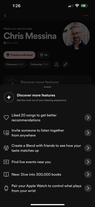
The changes were first spotted by Chris Messina, who shared screenshots of the tests on Twitter. He noted the additional cards on profiles and how the new layout was directing users to tap a button to “discover more features.”
Some Spotify users, however, said they’ve had the updated profiles for some time. But that’s only because the feature has been in live testing in multiple markets. These profiles are not fully rolled out to all users.
Spotify did not commit it would make the feature available for everyone at any particular time. Often, the company’s new ideas are tested in public, then modified based on user engagement and feedback before a global rollout. Or, in some cases, they’re scrapped entirely. That said, it’s not as likely that this one would be dropped, given how well it fits with the new Spotify redesign which puts greater emphasis on discovery.
“We routinely conduct a number of tests,” a company spokesperson told TechCrunch when asked about the new profiles. “Some of those tests end up informing our user experience and others serve only as an important learning. We don’t have anything further to share at this time,” they added.

Image Credits: Chris Messina via Twitter (opens in a new window)
Among the notable changes in this version of the user profiles is the new heading at the top of the screen that looks more like something you’d see on a social network. Currently, Spotify user profiles are fairly bare-bones. The person’s name as well as their follower and following counts are displayed above lists of their playlists and recently played artists. The new profiles, by comparison, include other details about the person like which Spotify plan they’re subscribed to, how long they’ve been a Spotify member, their general location (like the U.S.), in addition to their follower and following counts, a button that lets you follow them and another for profile edits.
There’s also a fun feature that apparently lets you set a “vibe” above your name, to give your profile a little pizazz.

Image Credits: Chris Messina via Twitter (opens in a new window)
The new profiles still feature sections for your playlists and artists, but these now appear as cards and there are more interactive features available next to these options. For instance, you can now click a button to create a new playlist right from your profile, or use buttons beside each playlist to share them with others. Next to each artist’s name, there also are buttons that let you follow the artist on Spotify — before, you’d have to click into the artist profile to do so. This could be particularly useful if you had visited someone else’s profile and were discovering new artists through their activity.
Under the “Discover more features” section on the new profiles, users are pointed to other things they can do on Spotify — like find live events, “like” more songs to improve their recommendations, create Blends with friends, check out Spotify’s new audiobooks and more.
The profiles also include a message at the bottom that reads “View more cards,” which indicates there will be future additions coming to this space beyond the playlists and recently played artists. But this feature isn’t fully built out yet — Messina told us that, when clicked, the in-app message reads “there’s nothing to see here yet” and informs users that Spotify is “busy building more content for you — coming soon.”
(May we suggest incorporating podcast recommendations into this experience, please?)
These changes would make sense as part of Spotify’s broader focus on discovery that’s driving its most recent app updates. That is, instead of just showcasing a user’s basic information and activity, these redesigned profiles would allow people to explore more of what Spotify has to offer while also making it easier to find and enjoy new artists and music directly from someone else’s profile with fewer clicks.
