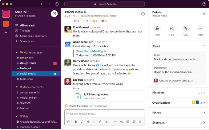
When Slack first launched in 2013, the product was quickly embraced by developers, and the early product reflected that. To get at advanced tools, you used a slash (/) command, but the company recognizes that as it moves deeper into the enterprise, it needed to simplify the interface.
Today, the company introduced a newly designed interface aimed at easing the user experience, making Slack more of an accessible enterprise communications hub.
Jaime DeLanghe, director of product management at Slack, says that the messaging application has become a central place for people to communicate about work, which has grown even more important as many of us have begun working from home as a result of COVID-19.
But DeLanghe says usage was up even before the recent work from home trend began taking off. “People are connected to Slack, on average, about nine hours a day and they’re using Slack actively for almost 90 minutes,” she told TechCrunch.
To that end, she says her team has been working hard to update the interface.
“From my team’s perspective, we want to make sure that the experience is as simple to understand and get on-boarded as possible,” she said. That also means surfacing more advanced tooling, which has been hidden behind those slash commands in previous versions of the tool.
She said that the company has been trying to address the needs of the changing audience over the years by adding many new features, but admits that has resulted in some interface clutter. Today’s redesign is meant to address that.

New Slack interface. Screenshot: Slack
Among the new features, besides the overall cleaner look, many people will welcome the new ability to nest channels to organize them better in the Channel sidebar. As your channels proliferate, it becomes harder to navigate them all. Starting today, users can organize their channels into logical groupings with labels.

New nested channel labels in Slack. Screenshot: Slack
DeLanghe is careful to point out that this channel organization is personal, and cannot be done at an administrative level. “The channels don’t actually live inside of another channel. You’re creating a label for them, so that you can organize them in the sidebar for just yourself, not for everybody,” she explained.
Other new features include an improved navigation bar at the top of the window, a centralized search and help tool also located at the top of the window and a universal compose button in the Sidebar.
All of these new features are designed to help make Slack more accessible to users, as more employees start using it across an organization.
