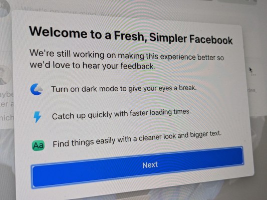
After months of testing, Facebook’s redesign is finally official. Announced last year at F8, the more minimalist approach to its desktop design has been rolled out in waves. In March, the company added an option to try out the new version. Users could switch back and leave feedback for why they had done so. This week, the redesign becomes official (and until you get it, the option to update manually is available, too).
Change is hard, especially when it comes to redesigning a popular website. Even the best redesign still requires some rewiring of the user’s brain to adapt. Simplicity is the thing here — that’s a particularly big ask for a platform like Facebook, which is constantly adding new venues for content. Having played around with it in its earlier iteration, I can say that Facebook’s not afraid to leave a blank canvas for this “fresh, simpler” design. Videos, games and groups are among those content types that will be prioritized here.
The redesign takes cues from the mobile app, designed to offer faster load times and easier navigation (again, it will take getting used to). “We’ve grown since Facebook .com launched 16 years ago,” the company writes. “We’ve built new features, optimized for new devices and operating systems, and expanded to hundreds of languages. Recently we’d focused on the mobile Facebook experience, and realized our desktop site had fallen behind. People need it to keep up.”
For many, however, the biggest news here may be the long-awaited arrival of dark mode for the desktop, as Facebook finally joins the likes of Twitter and countless apps. You’re no doubt well-versed with the benefits of dark mode: it’s easier on the eyes and generally makes for a better video viewing experience (a top priority for the company, these days).
Also new is the ability to create groups, pages and, naturally, ads faster than before. The new version also offers previews of each, so you know what you’re getting yourself into before hitting Publish.
The company says it’s still actively seeking user feedback. So you can voice your inevitable dissatisfaction through the Settings menu. Facebook will continue to tweak the design going forward, in a Sisyphean effort to please everyone on the internet.
