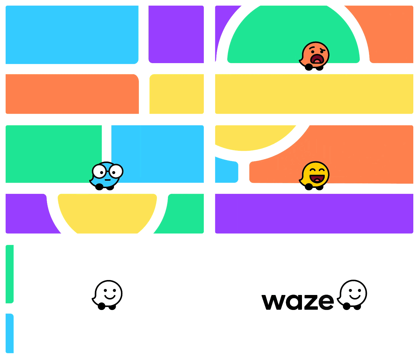
Crowdsourced navigation platform Waze, which is owned by Google and yet remains a separate, but intertwined product relative to Google Maps, just got one of its biggest UI and design overhauls ever. The new look is much more colourful, and also foregrounds the ability for individual drivers to share their current emotions with Moods, a set of user-selectable icons (with an initial group of 30) that can reflect how you’re feeling as you’re driving.
Moods may seem like a relatively small user personalization option, but it’s actually a very interesting way for Waze to add another data vector to the crowdsourced info it can gather. In a blog post describing the feature, Waze Head of Creative Jake Shaw talks about the added Mood set, which builds upon the Moods feature previously available in Waze and greatly expands the set of expressible emotions.
“The fundamental idea of Moods has always been the same: to reflect how users feel on the road,” he wrote. “We had a lot of fun exploring the range of emotions people feel out there. A dozen drivers could all feel different in the exact same situation, so we set about capturing as many of those feelings as possible. This was critical to us, because the Moods act as a visual reminder of all of us out there, working together.”
Extending Moods to be more varied and personalized definitely has the advantage of being more visually-appealing, and that could serve to boost its engagement among the Waze user community. They don’t mention this explicitly, but you can imagine that combining this as a sort of sentiment measure along with other crowd-reported navigational details including traffic status, weather conditions, construction and more could ultimately help Waze build a much richer dataset and resulting analyses for use in road planning, transportation infrastructure management and more.
This update also includes a full refresh of all the app’s interfaces, using colored shapes based around a grid system, and new icons for reported road hazards. It’s a big, bright changes, and further helps distinguish Waze’s visual identity from that of its sibling Google Maps, too.
Shaw talk repeatedly about the value of the voice of the community in informing this redesign, and it definitely seems interested in fostering further a sense of participation in that community, as distinct from other transportation and navigation apps. Oddly, this serves as a reminder that Google’s most successful social networking product, with the exception maybe of YouTube depending on how you define it, may well be Waze.
