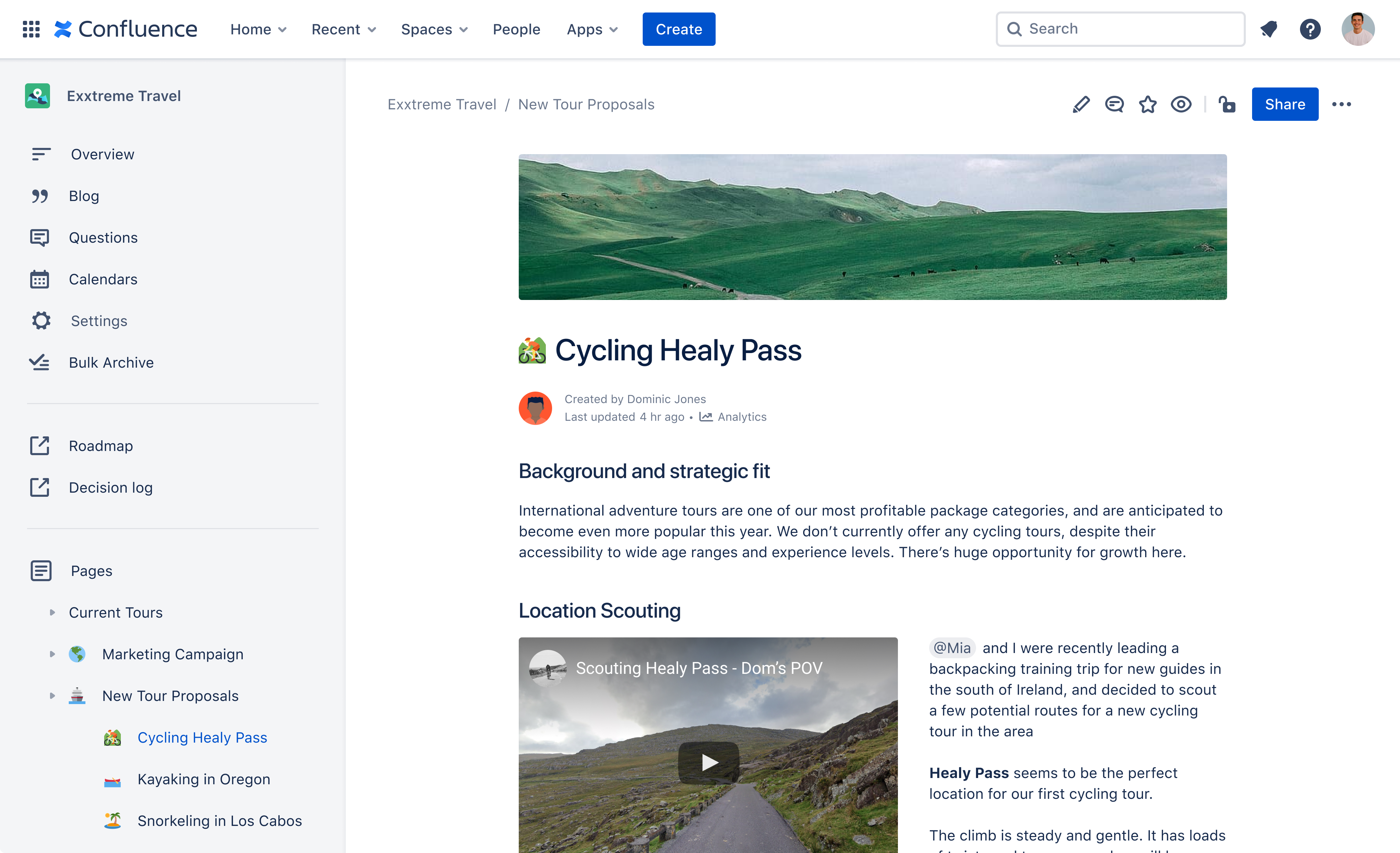
Confluence, Atlassian’s wiki-like collaborative workspace, has been around for more than 15 years, and is often a core knowledge-sharing tool for the companies that implement it. But for the most part, Confluence is a business tool and looks like it, with walls of text and the occasional graph, table or image. But user expectations have changed, and so it’s maybe no major surprise that Atlassian is now bringing a stronger emphasis on design to the service.
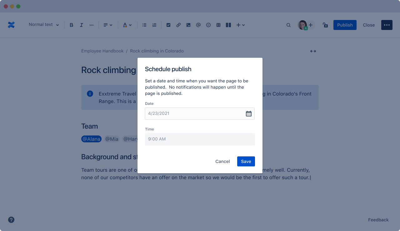
Today’s update, for example, brings to the service features like cover images, title emojis and customizable space avatars (that is, “icons that denote a ‘space’ or section of Confluence”). The team also recently introduced smart links, which allow you to paste links from services like YouTube and Trello and have the service immediately recognize them and display them in their native format. Other new features include the ability to schedule when a new page is published and the ability to convert pages to blog posts (because, as it turns out, Atlassian has seen a bit of a resurgence in corporate blogging — mostly for internal audiences — during the pandemic).
“We ended up doing something that we called ‘love sprint,’ where we prioritize about 30 features for the enhancements, which are all — if you think about the themes — about how you design information in this world where you have to read more, where you have to write more,” Natalia Baryshnikova, the head Of Product Management for Atlassian’s Confluence Experience Group, told me. “And there’s the attention span that’s kind of pushing its limits. So how do you design for that situation? How do you discover our content?”
Baryshnikova tells me that the team took a close look at how content production, management and delivery works in the social media world. But some of the new features are also purely a reaction to a changing work environment. Take the ability to schedule when pages are published, for example. Employees who work from home may work especially late or early right now, for example, in order to prioritize childcare. But they still want the content they produce to be seen inside the company, and that can be hard when you would otherwise publish it at 11 p.m., for example.
And having your content get noticed is getting harder because Confluence usage has dramatically increased in the last 12 months. As Atlassian noted today, more than 60,000 companies are now using the service. And inside those companies, those users are also far more active than ever before. The number of Confluence pages created from March 2020 to March 2021 increased by more than 33%. The average user now creates 11% more pages, but the product’s superusers have often doubled or tripled their output.
The use of Confluence has also helped many companies reduce their number of meetings, but as Baryshnikova noted, “not only are pages competing with meetings — but pages are competing with pages.” So using good graphics, for example, is a way for a user’s content to stand out in the noise of corporate content production. Which, I have to admit, strikes me as a somewhat strange dynamic. But I guess that just like on the web, in order to stand out in a corporate environment, you have to make the documents you produce stand out in order to get noticed. Maybe that — as well as the lack of watercooler conversations — is also the reason corporate blogging is seeing an uptick right now.


