If challenging the status quo was easy, we’d see a lot more of it. In the world of smartphones, this means daring to think outside the rectangle, a form factor that has been the default for more than a decade and a half. Slowly but surely amid stagnant smartphone sales, companies have been testing the water.
There have, in recent years, been a number of evolutionary dead ends. ZTE’s Axon M comes to mind. A valiant, if deeply flawed, attempt that was, for all intents and purposes, two smartphones stuck together. Samsung’s folding phones seemed destined for a similar fate early on.
After a few generations, the company has turned things around, even if longevity and mainstream implications of both the line and the category broadly are still something of a question. I can genuinely say, for instance, that I’ve enjoyed my time with the Galaxy Z Flip 3. It works as intended, isn’t overly unwieldy like many of its folding brethren and is honestly the first foldable device I would recommend.
Like Samsung, Microsoft has been well positioned to push the edges of the category. The company long ago abandoned hopes of being a mainstream mobile powerhouse. It’s not for lack of trying, of course. But not even its $7.2 billion Nokia acquisition could keep those dreams alive. Instead, the company found hardware solace in the Surface line, a modest success that has produced some genuinely compelling form factors.

Image Credits: Brian Heater
The first Surface Duo was born out of that line, which prided itself in thinking outside the standard PC/tablet form factor. At an event in October 2019, the company introduced the dual-screen Neo laptop and the smaller Duo, a dual-screen Android handset. The former never made it into production. In May, Microsoft confirmed the death of Windows 10X and, seemingly, hopes of the Neo along with it.
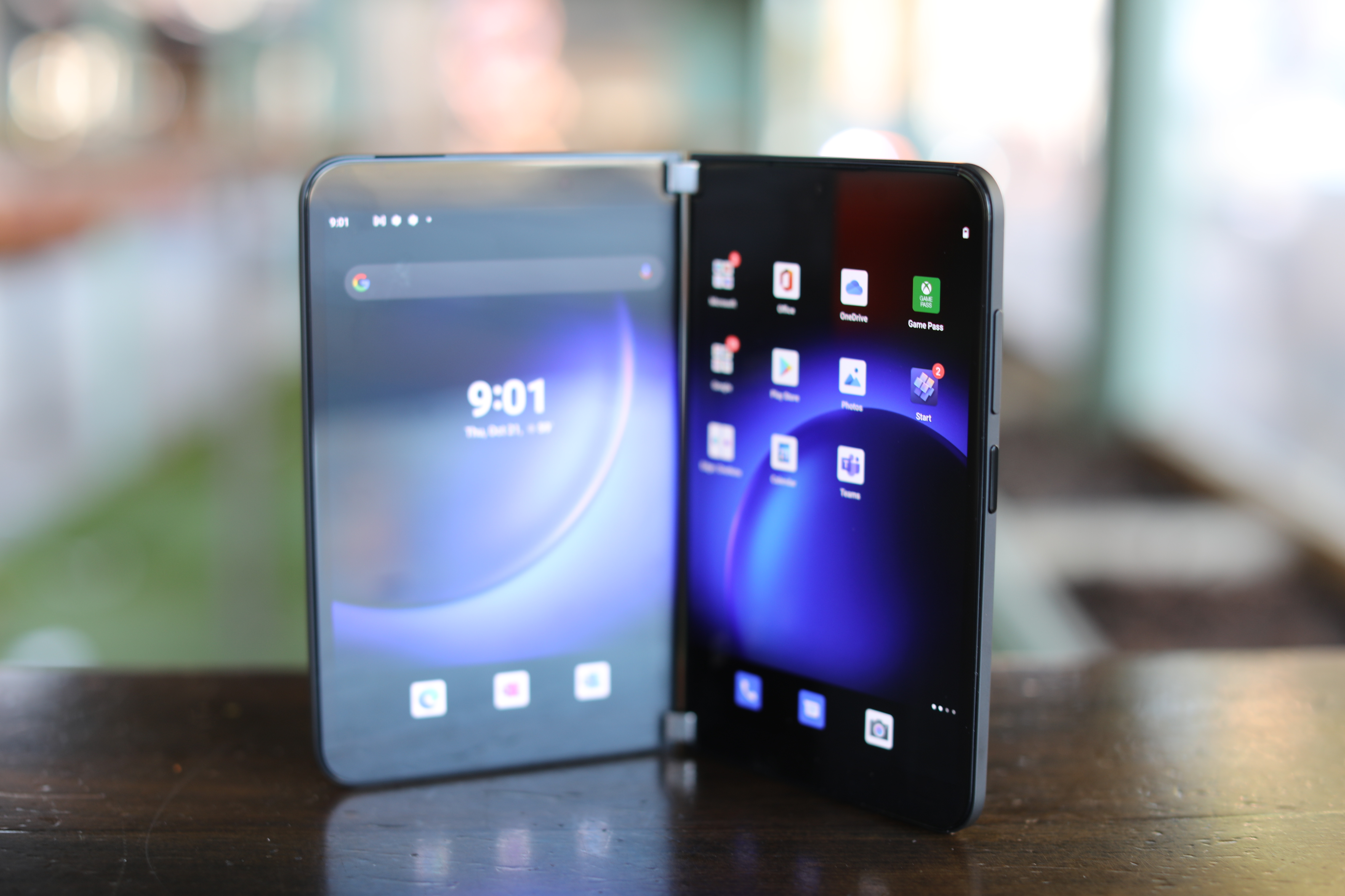
When the Duo launched last fall, it was one of the year’s most eagerly anticipated devices. Like ZTE, Microsoft circumvented the need for a foldable display by fusing two screens together with a hinge. With nearly a decade of Surface hardware under its belt, however, the company had clearly created a far more elegant solution. But like the Axon M before it, the original Duo largely disappointed.
It wasn’t a failure from a hardware perspective, exactly (though sales may tell a different story), but it was plagued with too many issues to come anywhere near justifying its $1,400 asking price. The lack of an external camera, buggy software and the decision not to include 5G were among the major pain points in a device loaded with pain points. First-generation products are going to be imperfect — that’s the plight of the early adopter.

Image Credits: Brian Heater
But when asking consumers to shell out that much money for a new device, there are certain levels of quality one anticipates — ones the original Duo failed to meet. Much to its credit, however, Microsoft listened. Obviously that doesn’t help those chosen few who purchased the original product, but the company is clearly committed to doing better by future customers. In that sense, the Surface Duo 2 is more than just an update to the original device — it’s an effort to correct some of its predecessor’s biggest mistakes.
You could make a fairly convincing argument that Microsoft would have saved itself a lot of heartache had the first Duo been closer to this new model. The addition of the Snapdragon 888 with 5G, a rear-facing triple camera setup, narrowing the gap between the dual-screens and the continued improvement of software are important steps in the right direction. But the Duo 2 is still far from the sort of device you can heartily recommend. The next couple of generations — should Microsoft continue to invest in the device — will determine whether the issues with the device are fundamental or something that simply required continued refinement.

Image Credits: Brian Heater
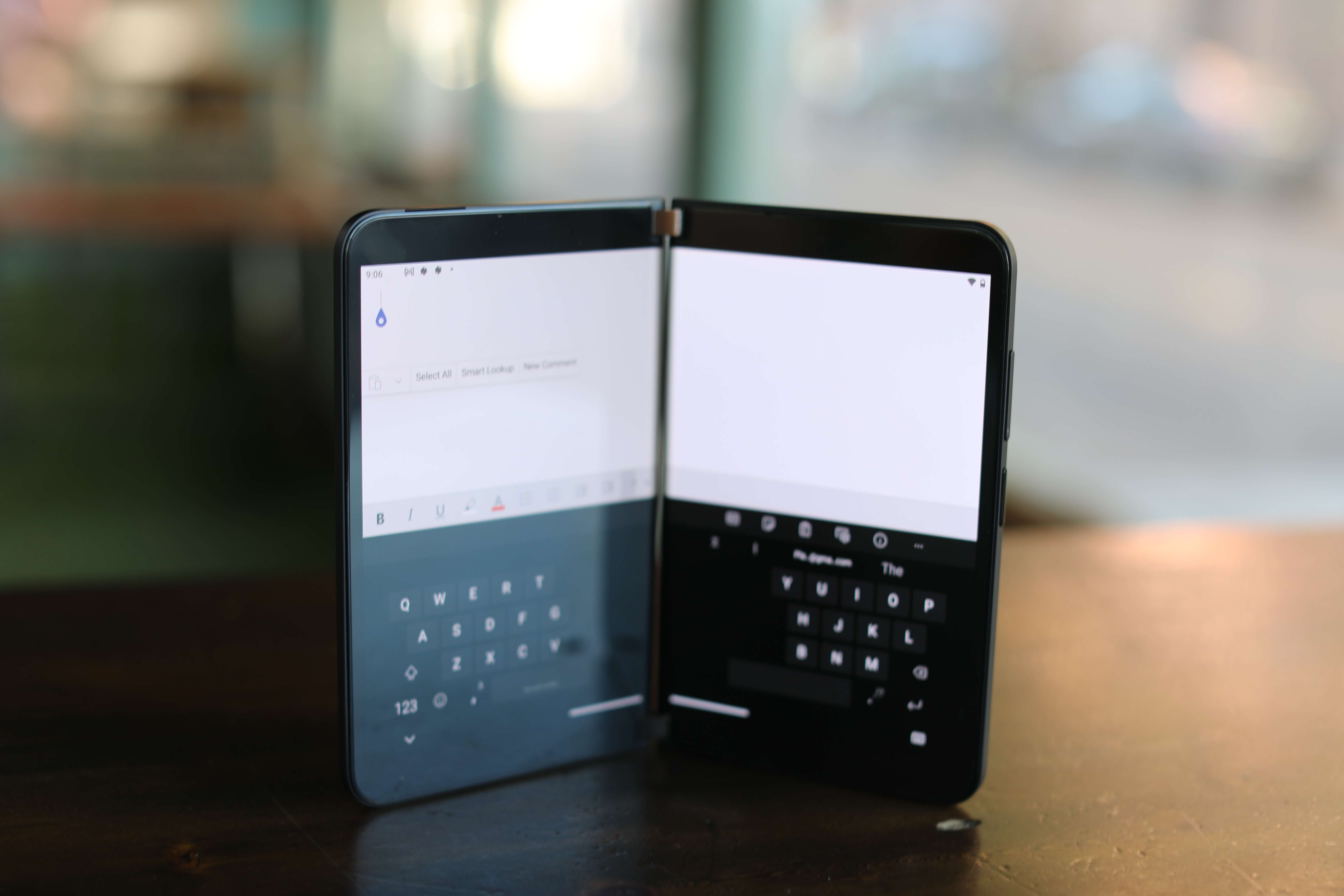
The software, which can still be buggy switching between displays, is likely the latter. Along with developing its own dual-screen software, Microsoft is utilizing much of the work Google has done with companies like Samsung to create a version of Android that works on foldables. Of course, developing for a foldable and a dual-screen form factor is not a perfect one-to-one. But given Microsoft’s immense resources, perfecting that experience is likely a matter of how much time and money it’s willing to invest — that, in turn, is a product of perceived interest in the device.
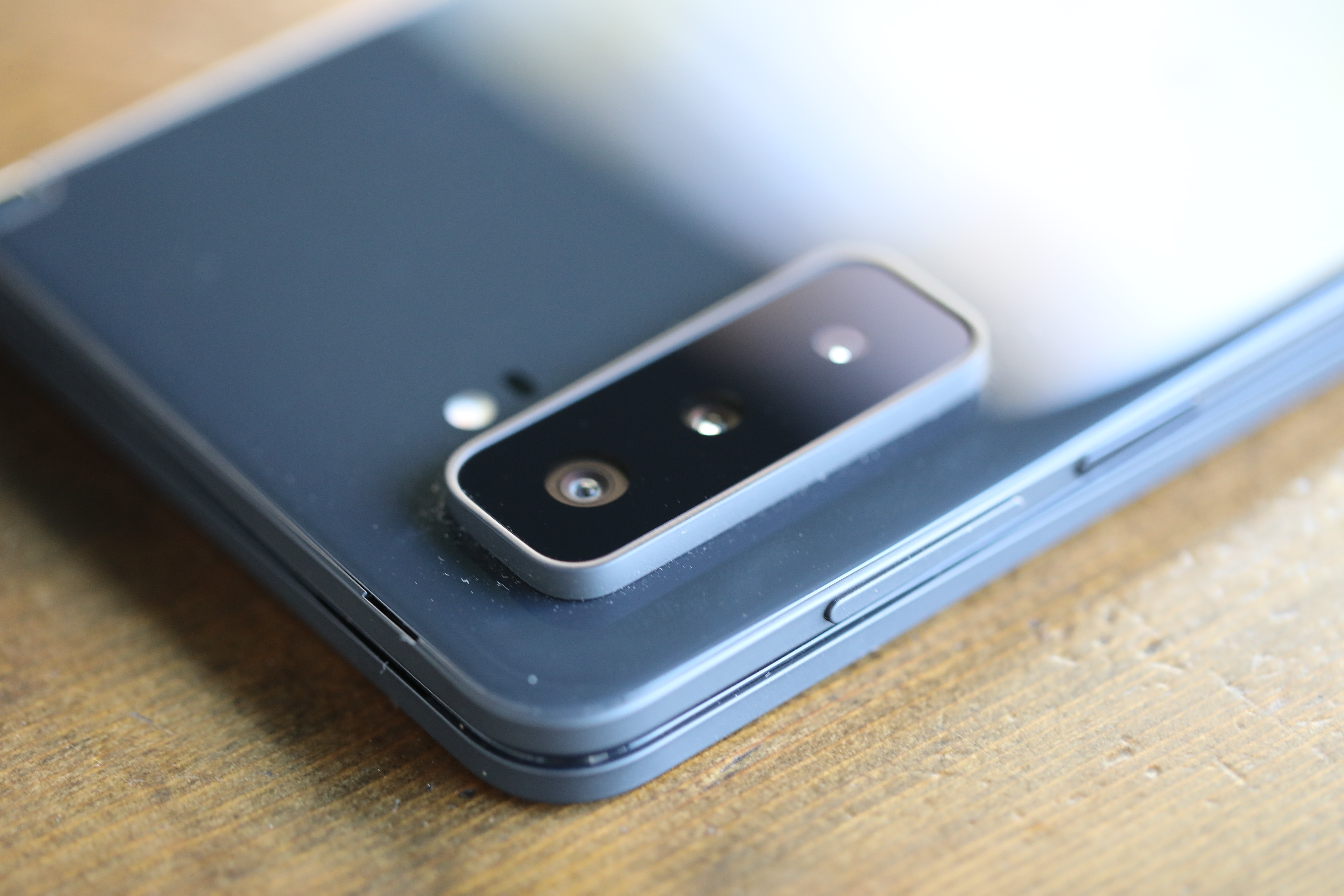
Where the original Duo relied on an internal camera for shooting, the 2 now has three rear-facing cameras: a 12-megapixel wide, 12-megapixel telephoto and 16-megapixel ultra-wide. That certainly sounds good on the face of it — and it’s undoubtedly an improvement. But the camera app is barebones and the picture quality was consistently sub-par compared to significantly less expensive systems. The Duo struggled in mixed and low light more than one would hope on a $1,500 system in 2021.

Image Credits: Brian Heater
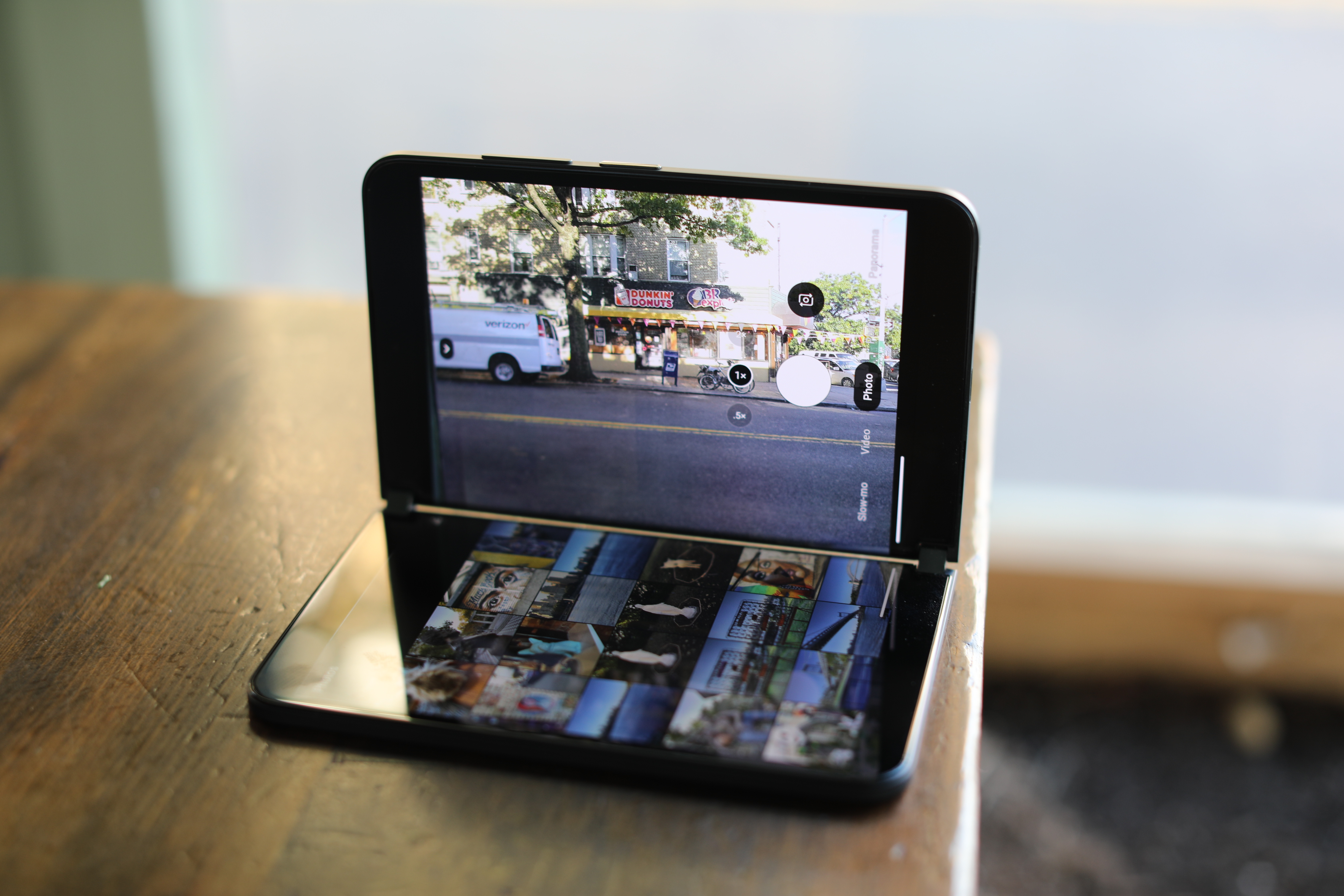
Microsoft isn’t as invested in mobile photography as Samsung, Apple or Google. That certainly shows here, but it’s also something that can be improved upon in future generations. Ultimately, however, the camera leads us to one of the potentially fundamental issues with the device. Among the reasons the original Duo relied on an internal camera is a pragmatic issue of form factor: flipping the device open with the camera on one side and the second display serving as a viewfinder on the other.
The company has actually done a decent job working with the camera bump, so the rear of the displays sit together at a slight angle. But actually using the thing is a pain. It’s somewhat handy having the second screen to display the shots after they’re taken, but the process is unwieldy — more akin to attempting to photograph something using a tablet.
In spite of some seemingly unavoidable flaws like this, the Duo 2 is a nice piece of hardware, and the addition of features like Microsoft Pen support and dual-screen gaming, which arrived on the original Duo back in May, get the product closer to where it should be. Other nice touches like the Glance Bar, which shows glimpses of notifications in the gap between screens when the device is closed, demonstrate how Microsoft is continuing to work cleverly with the form factor it has. But with continued issues and an asking price of $1,500, any hope of the product becoming truly mainstream feel — at best — multiple generations away.
