We’ve seen attempts at gathering all cards (credit, debit, loyalty, etc.) in one before, but Card Blanch claims to have a fresh take on the concept and closed just shy of half a mil worth of angel investments with a very elegant deck. The company gets a few parts of the slide deck right that we rarely see done well, so that’s wonderfully refreshing. Let’s dive right in!
We’re looking for more unique pitch decks to tear down, so if you want to submit your own, here’s how you can do that.
Slides in this deck
Card Blanch’s deck consists of just 12 slides, and the team tells us that it is exactly as pitched without redactions.
- Cover slide
- Problem slide
- Market size slide
- Solution slide
- Product slide
- “How it works” slide
- Competition slide
- Revenue model slide
- Market opportunity slide
- “Next steps” — the ask slide
- “Your whole wallet in one card” — value prop slide
- “Complete spending analytic in one place”— summary slide
Three things to love
The graphic designers over at Card Blanch deserve a raise; this is one of the best-designed decks I’ve seen in a hot minute. Let’s take a peek at the highlights:
Well, that’s a big enough market

[Slide 3] Of course there’s a huge market size … Image Credits: Card Blanch
I don’t think anyone was going to argue against the number of cards in circulation and use in the U.S., and perhaps I’d have liked to have seen more of a “what’s the market we are going after?” type of approach, but as far as market-size slides go, this is hard to argue with.
Store cards, loyalty cards, credit cards — they all have different advantages (otherwise, the average American wouldn’t be carrying six cards with them all the time). I love how this slide presents the data simply and cleanly. And the “text flows behind the person” design is a very nice touch indeed.
If your market is huge and obvious, you can get away with a market slide like this. One thing, however: This is probably a very mature and rather plateaued market. I doubt there’s a lot more growth to be had in this industry. That means that to really stand out, you have to offer an enormous customer benefit. Can Card Blanch pull that off?
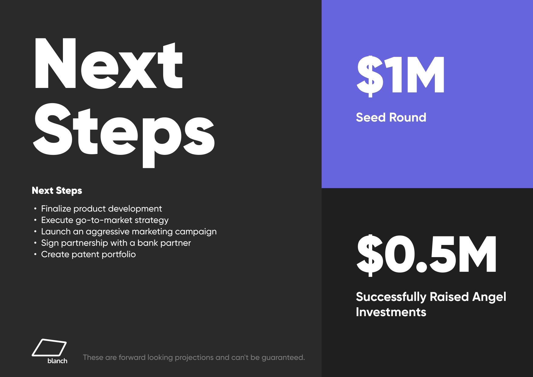
Awesome “ask” slide

[Slide 10] This is a good “ask” slide. In fact, it’s so good that we added it to our article that focuses on that very slide. Image Credits: Card Blanch
OK, so this is not a complete slam dunk as an “ask” slide, but at least it has a specific amount of money that’s being raised, and it has a number of goals that will be delivered in the next stretch of the company’s existence.
I wish the slide used SMART — specific, measurable, achievable, relevant and time-based — goals. This list is great, but none of the milestones are specifically measurable (product development will never be finalized; go-to-market will never be complete; “aggressive” doesn’t mean anything without numbers attached, etc.) or has specific deadlines attached. Still — it’s rare that I see slides that are even this good, so I figured I’d celebrate it nonetheless.
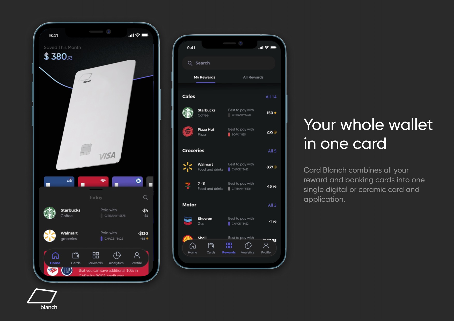
So easy to understand

[Slide 11] Really good product-driven storytelling. Image Credits: Card Blanch
If your would-be investors are going through your deck to see if you’re trying to defraud them, that’s not a great first impression.
What Card Blanch really masters is telling its story through design mockups. The full story of how the product works — paying with the right card in the right place to maximize card benefits — fits into four elegant screenshots. (Slide 12 includes the rest.)
It’s a really good storytelling device because the founders can give a voice-over of how it all works. Or will work?
That’s a quirk about this pitch deck: Nowhere in the deck is it stated how much of this is actually built and how much is mock-ups and good ideas. That’s not uncommon in pre-seed/angel stage pitch decks, to be clear, but in a world where investors are trying to ascertain how much risk is in the startup, including an update about what has been done so far would be helpful.
In the rest of this teardown, we’ll take a look at three things Card Blanch could have improved or done differently, along with its full pitch deck!
